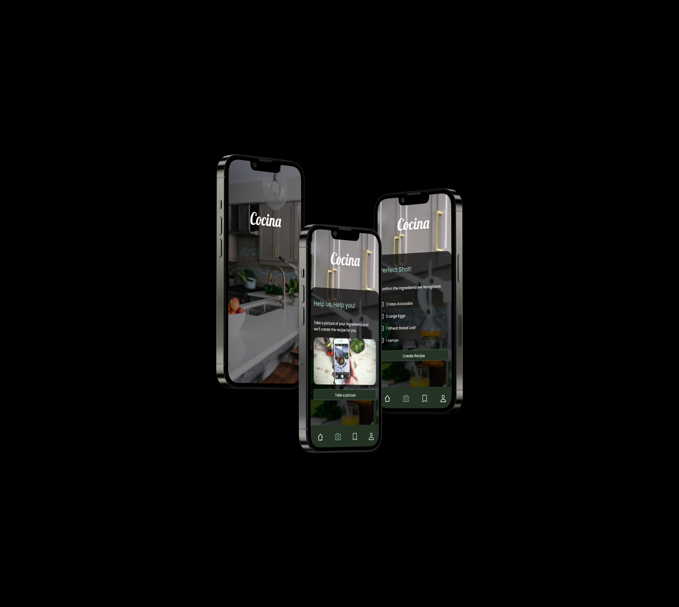
Cocina App
Project overview
My main goal was to create a wellness recipe app that will motivate healthy individuals to create meals with the ingredients they currently have in their kitchen by simply taking a picture of the remaining food they have. I mean, how often do you toss out spoiled food as a consequence of not knowing how to put it in a recipe?
Surveys
In order for me to better understand the people that would be utilizing this app, I held some interviews at my gym and sent out surveys to other health oriented individuals.
Competitor Analysis
I researched which were the top downloaded recipe apps of 2022 and came across Yummly and Tasty.
Even though we all use our smart phone for just about everything these days, I learned that none of these popular competitors had a feature where you can take a picture of what you have currently have in your kitchen, resulting in the app creating the recipe for you.
M0SCoW Method
I utilized the MOSCOW method to prioritize my ideas.
My must haves and should haves make up the Minimum Viable Product (MVP).
My could haves were a possible app feature idea to add in the future.
User Flow
Before Jumping into wireframes, I created a user-flow to better understand how many screens I needed as well as the functions in each. I focused on the main user-flow which is when the user takes a picture of the ingredients they have resulting in the recipe suggestions.
lofi’s
Based on the user-flow, I sketched the lo-fi wireframes and then ran usability testing with my classmates. I briefed them on the main purpose of the app and asked them to perform the task as if they wanted to create a recipe by taking a picture of ingredients. The only roadblock found was when users attempted to find the button to take the picture. Therefore I knew it had to be modified on the mid-fi’s.
MId-fi’s
I made the changes in the mid-fi’s to account for the imperfections on the lo-fi wireframes. I implemented a button evident as to where the user needed to click to take the picture.
The mid-fi wire frames went through usability testing with 11 different users. The testing results revealed that all 11 users had 100% success rate when completing the main task flow.
However 5 of the users mentioned I should add a camera icon to the button to better display where to click. So I made sure to implement it in the hi-fi’s.
MOOD BOARD
When creating the mood board, I thought of a fresh, modern, dark themed approach, which i later tested with classmates, who confirmed the attributes I was attempting to implement.


